Optimizing Pursuant Health Kiosk
Research & Redesign to Boost User Adoption and Satisfaction
TIMELINE
Aug. 2025 - Dec. 2025
TEAM
Ashlyn McClendon
Mandy Lin
Mili Parikh
QM Islam Naushadul
ROLES
UX Designer
User Researcher
MENTORS
Zlatomir Stoichev
Leslie Sommers
Dan Tennenboim (TA)
Carrie Bruce (Instructor)

PROJECT DESCRIPTION
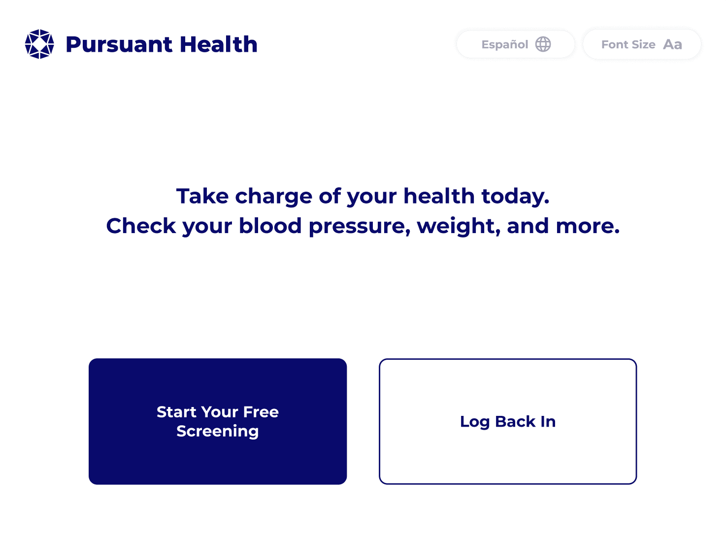
Pursuant identified that the majority of their kiosk users were bypassing registration entirely, opting instead to use it as guests. It was clear that the login experience was creating unnecessary friction. This project involved a comprehensive redesign of the interface and authentication system, focusing on streamlining the sign-up flow and better communicating the value of account creation to users.
THE PROBLEM SPACE
Pursuant has 4,600 health screening kiosks located in most Walmart’s and select CVS’s across the country. These kiosks allow users to check their blood pressure, weight, and more.
Who is Pursuant?
Their Problem
90% of Pursuant users do not make an account and use the kiosk as a ‘guest’. Without an account users can not save their health data and track it over time.
Users are currently required to give an email address to sign up. All login and sign up happens on the kiosk interface. Pursuant has tried removing the guest option, but saw significantly less usage.


Current Solutions
RESEARCH QUESTION
Bearing these aspects of the problem space in mind, Pursuant asked us:
?

How might we design a seamless and secure log-in experience that encourages users to create accounts and return to the kiosk?
OUR FINAL SOLUTION


TIMELINE
We underwent a 4 month research and design process…
Weeks 1 - 3
Competitive Analysis
Lit Review
Problem Analysis
Surveys
Field Observations
Concept Ideation
Contextual Interviews
Research Synthesis
Low Fidelity Prototype
Usability Evaluations
High Fidelity Prototype
High Fidelity
Prototype V2
Weeks 4 - 7
Weeks 8 - 9
Weeks 10 - 12
Weeks 13 - 15
I led the starred methods
TARGET AUDIENCE
Wasting Time
(36%)
Taking Control
of Health
(23%)
New Users
(12%)
Picking Up Prescriptions
(19%)
Routine
Health
Monitors
(10%)
Pursuant has identified five clusters that represent their kiosk users. We made an effort to have all of these groups represented in our research and testing. These users varied in age, usage motivation, and frequency of kiosk use.
RESEARCH METHODS
We ran six different research methods to get a solid mix of qualitative and quantitative data. It was important to us to talk to actual kiosk users, so we focused our recruitment on the 55+ age group since they make up the heart of the user base. We also made sure to include people from every Pursuant-identified user cluster so we didn't miss any key perspectives across the board.
Competitive Analysis
3 competitors
Analyzed brands like Higi which also specialize in developing store-based health kiosks
" height="65.59525713027412px" id="ZlS8R3N7S" stroke-dasharray="" stroke-linecap="round" stroke-linejoin="miter" stroke-miterlimit="10" stroke-width="9" stroke="rgb(0, 53, 94)" transform="translate(4.774 51.441)" width="164.7246906127544px"/><path d="M 32.5 0 C 50.483 0 65 14.361 65 32 C 65 49.639 50.483 64 32.5 64 C 14.517 64 0 49.639 0 32 C 0 14.361 14.517 0 32.5 0 Z" fill="rgb(191, 212, 228)" height="64px" id="Y_xLtoZT8" stroke-dasharray="" stroke-linecap="butt" stroke-linejoin="miter" stroke-miterlimit="10" stroke-width="5" stroke="rgb(36, 95, 140)" transform="translate(57 50.5)" width="65px"/><path d="M 0 12.5 C 0 5.596 5.596 0 12.5 0 C 19.404 0 25 5.596 25 12.5 C 25 19.404 19.404 25 12.5 25 C 5.596 25 0 19.404 0 12.5 Z" fill="rgb(36, 95, 140)" height="25px" id="s2Jy4xcWs" stroke-dasharray="" stroke-linecap="butt" stroke-linejoin="miter" stroke-miterlimit="10" stroke-width="5" stroke="rgb(36, 95, 140)" transform="translate(77 70.5)" width="25px"/><path d="M 45 31.5 L 45 0 M 65.5 34 L 74.5 10 M 83 40 L 89 27 M 23.5 34 L 15 10 M 6.5 40 L 0 27" fill="transparent" height="40px" id="hA2ea8jhq" stroke-dasharray="" stroke-linecap="round" stroke-linejoin="miter" stroke-miterlimit="10" stroke-width="9" stroke="rgb(0, 53, 94)" transform="translate(43.5 6)" width="89px"/></svg>)
Field Observations
5 users
Observed users inside of Walmart to understand how they interact with the kiosk.
" height="13.975005860329048px" id="AgnsUs2We" stroke-dasharray="" stroke-linecap="round" stroke-linejoin="miter" stroke-miterlimit="10" stroke-width="5" stroke="rgb(36, 95, 140)" transform="translate(6.5 128.227)" width="173px"/><path d="M 2 0 L 14 0 L 164 0 L 172 0 C 173.105 0 174 0.895 174 2 L 174 100.045 C 174 101.312 172.828 102.257 171.584 102.017 C 139.566 95.822 120.637 100.709 86.324 106.446 C 86.112 106.481 85.888 106.482 85.675 106.449 C 52.59 101.204 33.215 95.236 2.469 101.94 C 1.209 102.215 0 101.264 0 99.974 L 0 2 C 0 0.895 0.895 0 2 0 Z" fill="rgb(255, 255, 255)" height="106.47292205848694px" id="MHylF8Kww" stroke-dasharray="" stroke-linecap="round" stroke-linejoin="miter" stroke-miterlimit="10" stroke-width="5" stroke="rgb(36, 95, 140)" transform="translate(6 26.727)" width="174px"/><path d="M 0 106.5 L 0 4.441 C 0 3.455 0.733 2.613 1.708 2.466 C 37.239 -2.916 53.719 -0.404 72 19.228 C 94.935 -0.006 113.562 -0.327 147.661 2.57 C 148.695 2.658 149.5 3.524 149.5 4.562 L 149.5 106.378 C 149.5 107.61 148.389 108.547 147.17 108.361 C 116.303 103.654 99.445 107.229 72 124.728 C 47.61 109.708 32.166 105.533 2.224 108.498 C 1.04 108.615 0 107.69 0 106.5 Z" fill="rgb(255, 255, 255)" height="124.72800388800968px" id="kUgIYnwor" transform="translate(20 6)" width="149.5px"/><path d="M 72 124.728 C 47.61 109.708 32.166 105.533 2.224 108.498 C 1.04 108.615 0 107.69 0 106.5 L 0 4.441 C 0 3.455 0.733 2.613 1.708 2.466 C 37.239 -2.916 53.719 -0.404 72 19.228 M 72 124.728 C 99.445 107.229 116.303 103.654 147.17 108.361 C 148.389 108.547 149.5 107.61 149.5 106.378 L 149.5 4.562 C 149.5 3.524 148.695 2.658 147.661 2.57 C 113.562 -0.327 94.935 -0.006 72 19.228 M 72 124.728 L 72 19.228" fill="transparent" height="124.7280044555664px" id="bBc8xwC4E" stroke-dasharray="" stroke-linecap="round" stroke-linejoin="miter" stroke-miterlimit="10" stroke-width="5" stroke="rgb(36, 95, 140)" transform="translate(20 6)" width="149.5px"/><path d="M 71.5 11.649 C 85.923 1.409 95.932 -0.374 118 5.149 M 71.5 40.649 C 85.923 30.409 95.932 28.626 118 34.149 M 71.5 25.649 C 85.923 15.409 95.932 13.626 118 19.149 M 0 1.649 C 26.303 -2.651 32.959 1.729 46.5 11.649 M 0 15.649 C 14.502 13.741 21.494 13.692 29 20.149" fill="transparent" height="40.6492201390217px" id="GRKRgymWg" stroke-dasharray="" stroke-linecap="round" stroke-linejoin="miter" stroke-miterlimit="10" stroke-width="5" stroke="rgb(0, 53, 94)" transform="translate(33.5 27.578)" width="118px"/></svg>)
Literature Review
7 key sources
Conducted analysis of existing health technology and health kiosk research to understand the current/historical market and user base.
Qualtrics Survey
19 respondents
Deployed a heat map survey on Qualtrics to simulate the kiosk interface and remotely gather data about how users would interact with the kiosk.
Kiosk Exit Survey
2,267 respondents
Created an exit survey that was deployed across select kiosks in the nation to understand users preferred login methods and devices.
" height="52.914394613494686px" id="GgjZQBPS9" transform="translate(4 41.676)" width="62.844211718132954px"/><path d="M 56.223 9.99 L 57.061 9.444 L 57.061 9.444 Z M 63.098 51.719 L 64.091 51.841 L 64.091 51.841 Z M 1.995 51.794 L 2.983 51.643 L 2.983 51.642 Z M 32.417 6.061 L 32.417 7.061 L 32.417 7.061 Z M 16.789 1.716 L 16.201 0.908 Z M 44.549 1.786 L 45.174 2.566 Z M 48.284 1.51 L 47.696 2.319 C 50.554 4.397 53.168 7.134 55.386 10.536 L 56.223 9.99 L 57.061 9.444 C 54.718 5.849 51.938 2.931 48.873 0.701 Z M 56.223 9.99 L 55.386 10.536 C 61.29 19.596 64.351 33.261 62.106 51.598 L 63.098 51.719 L 64.091 51.841 C 66.375 33.19 63.296 19.012 57.061 9.444 Z M 60.616 53.916 L 60.616 52.916 L 4.466 52.916 L 4.466 53.916 L 4.466 54.916 L 60.616 54.916 Z M 1.995 51.794 L 2.983 51.642 C -0.742 27.274 6.542 10.411 17.378 2.525 L 16.789 1.716 L 16.201 0.908 C 4.577 9.367 -2.793 27.092 1.006 51.945 Z M 20.503 1.959 L 19.889 2.749 C 23.367 5.453 27.709 7.061 32.417 7.061 L 32.417 6.061 L 32.417 5.061 C 28.173 5.061 24.259 3.614 21.117 1.17 Z M 32.417 6.061 L 32.417 7.061 C 37.23 7.061 41.659 5.38 45.174 2.566 L 44.549 1.786 L 43.924 1.005 C 40.747 3.548 36.755 5.061 32.417 5.061 Z M 16.789 1.716 L 17.378 2.525 C 18.042 2.041 19.056 2.101 19.889 2.749 L 20.503 1.959 L 21.117 1.17 C 19.773 0.125 17.766 -0.231 16.201 0.908 Z M 4.466 53.916 L 4.466 52.916 C 3.725 52.916 3.095 52.375 2.983 51.643 L 1.995 51.794 L 1.006 51.945 C 1.267 53.653 2.737 54.916 4.466 54.916 Z M 63.098 51.719 L 62.106 51.598 C 62.013 52.35 61.374 52.916 60.616 52.916 L 60.616 53.916 L 60.616 54.916 C 62.385 54.916 63.876 53.597 64.091 51.841 Z M 48.284 1.51 L 48.873 0.701 C 47.291 -0.449 45.264 -0.067 43.924 1.005 L 44.549 1.786 L 45.174 2.566 C 46.006 1.9 47.029 1.833 47.696 2.319 Z" fill="rgb(0, 53, 94)" height="54.91563616333008px" id="HiSPK0les" transform="translate(3.001 40.675)" width="64.84319902176308px"/><path d="M 18.884 0 C 29.302 0 37.768 8.551 37.768 19.124 C 37.767 29.697 29.302 38.247 18.884 38.247 C 8.466 38.247 0 29.697 0 19.124 C 0 8.551 8.466 0 18.884 0 Z" fill="rgb(36, 95, 140)" height="38.2471px" id="iaMMUIjl2" stroke-dasharray="" stroke-linecap="butt" stroke-linejoin="miter" stroke-miterlimit="10" stroke-width="2" stroke="rgb(0, 53, 94)" transform="translate(16.583 3)" width="37.7676px"/><path d="M 43.55 0.784 C 44.636 -0.085 46.161 -0.309 47.285 0.509 C 50.247 2.663 52.944 5.49 55.224 8.989 C 61.294 18.303 64.363 32.224 62.099 50.718 C 61.945 51.972 60.88 52.914 59.617 52.914 L 3.467 52.914 C 2.232 52.914 1.182 52.013 0.996 50.792 C -2.767 26.182 4.561 8.889 15.79 0.716 C 16.905 -0.095 18.415 0.113 19.504 0.959 C 22.813 3.533 26.941 5.061 31.417 5.061 C 35.992 5.061 40.204 3.464 43.55 0.784 Z" fill="rgb(191, 212, 228)" height="52.91442887410222px" id="G6Wklmy5T" transform="translate(42.893 46.911)" width="62.843984972273475px"/><path d="M 56.223 9.99 L 57.061 9.444 L 57.061 9.444 Z M 63.098 51.719 L 64.091 51.841 L 64.091 51.841 Z M 1.995 51.794 L 2.983 51.643 L 2.983 51.642 Z M 32.416 6.062 L 32.416 7.062 L 32.416 7.062 Z M 16.789 1.717 L 17.378 2.526 Z M 20.503 1.96 L 19.889 2.75 Z M 48.284 1.51 L 47.696 2.319 Z M 44.549 1.786 L 43.924 1.005 Z M 48.284 1.51 L 47.696 2.319 C 50.554 4.397 53.168 7.134 55.386 10.536 L 56.223 9.99 L 57.061 9.444 C 54.718 5.849 51.938 2.931 48.873 0.701 Z M 56.223 9.99 L 55.386 10.536 C 61.29 19.596 64.351 33.261 62.106 51.598 L 63.098 51.719 L 64.091 51.841 C 66.374 33.19 63.296 19.011 57.061 9.444 Z M 60.616 53.916 L 60.616 52.916 L 4.466 52.916 L 4.466 53.916 L 4.466 54.916 L 60.616 54.916 Z M 1.995 51.794 L 2.983 51.642 C -0.742 27.274 6.542 10.412 17.378 2.526 L 16.789 1.717 L 16.201 0.909 C 4.577 9.368 -2.793 27.092 1.006 51.945 Z M 20.503 1.96 L 19.889 2.75 C 23.366 5.454 27.708 7.062 32.416 7.062 L 32.416 6.062 L 32.416 5.062 C 28.172 5.062 24.259 3.615 21.117 1.171 Z M 32.416 6.062 L 32.416 7.062 C 37.229 7.062 41.659 5.381 45.174 2.566 L 44.549 1.786 L 43.924 1.005 C 40.747 3.549 36.754 5.062 32.416 5.062 Z M 16.789 1.717 L 17.378 2.526 C 18.042 2.042 19.056 2.102 19.889 2.75 L 20.503 1.96 L 21.117 1.171 C 19.773 0.126 17.766 -0.23 16.201 0.909 Z M 4.466 53.916 L 4.466 52.916 C 3.725 52.916 3.095 52.375 2.983 51.643 L 1.995 51.794 L 1.006 51.945 C 1.267 53.653 2.737 54.916 4.466 54.916 Z M 63.098 51.719 L 62.106 51.598 C 62.013 52.35 61.374 52.916 60.616 52.916 L 60.616 53.916 L 60.616 54.916 C 62.384 54.916 63.875 53.597 64.091 51.841 Z M 48.284 1.51 L 48.873 0.701 C 47.291 -0.449 45.263 -0.067 43.924 1.005 L 44.549 1.786 L 45.174 2.566 C 46.006 1.9 47.029 1.833 47.696 2.319 Z" fill="rgb(0, 53, 94)" height="54.915628533935546px" id="fRgMs1Slk" transform="translate(41.894 45.91)" width="64.84321237379811px"/><path d="M 18.642 0 C 28.914 0 37.283 8.539 37.283 19.124 C 37.283 29.708 28.914 38.247 18.642 38.247 C 8.369 38.247 0 29.709 0 19.124 C 0 8.539 8.369 0 18.642 0 Z" fill="rgb(191, 212, 228)" height="38.24705px" id="dxHwYwbJl" stroke-dasharray="" stroke-linecap="butt" stroke-linejoin="miter" stroke-miterlimit="10" stroke-width="2" stroke="rgb(0, 53, 94)" transform="translate(55.866 7.969)" width="37.2832px"/></svg>)
Contextual Interviews
6 users
1:1 contextual interviews were conducted to get a better sense of user motivations and pain points with using the kiosk.
To make sense of our qualitative data, we built an affinity map to highlight the biggest pain points in the login process and UI. We uncovered some feedback regarding the physical kiosk and sound design, but we set those aside to stay focused on our digital goals. We then paired these insights with quantitative charts to provide a clear, data-backed picture of the user experience.
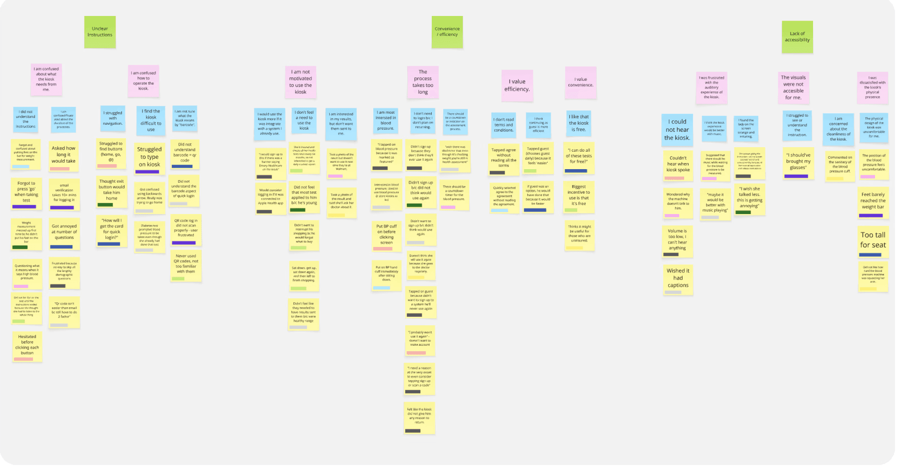
RESEARCH FINDINGS
From our data synthesis, we were able to identify five key initial research findings. that became the foundation of our redesign. Our research revealed that…
USER NEEDS & DESIGN IMPLICATIONS
We took our five core research findings and translated them into actionable user needs. From there, we explored the design implications for each, ensuring that every feature we were going to build would be a direct response to real user challenges.
User Needs
Design Implications
Users should be able to easily understand how to use the kiosk, the process, and the interface.
The kiosk's signage and instructions should be clear and accessible by using readable font sizes and intentional color contrast.
Users should not be required to give out all of their personal information multiple times.
The system should only require necessary information and have users input it one time because they dislike providing personal and contact information to the kiosk.
Users should be able to complete the process in as few steps as possible
The kiosk's flow should be effective and intuitive for users because too many steps can deter them from using the kiosk.
Users need to clearly understand the benefits of using the kiosk to be motivated to use it consistently.
The kiosk needs to clearly convey its usage benefits to users at the beginning of the experience.
Users need to feel in control of their personal health data.
The kiosk should emphasize users feeling in control of their personal health data and build trust with the system.
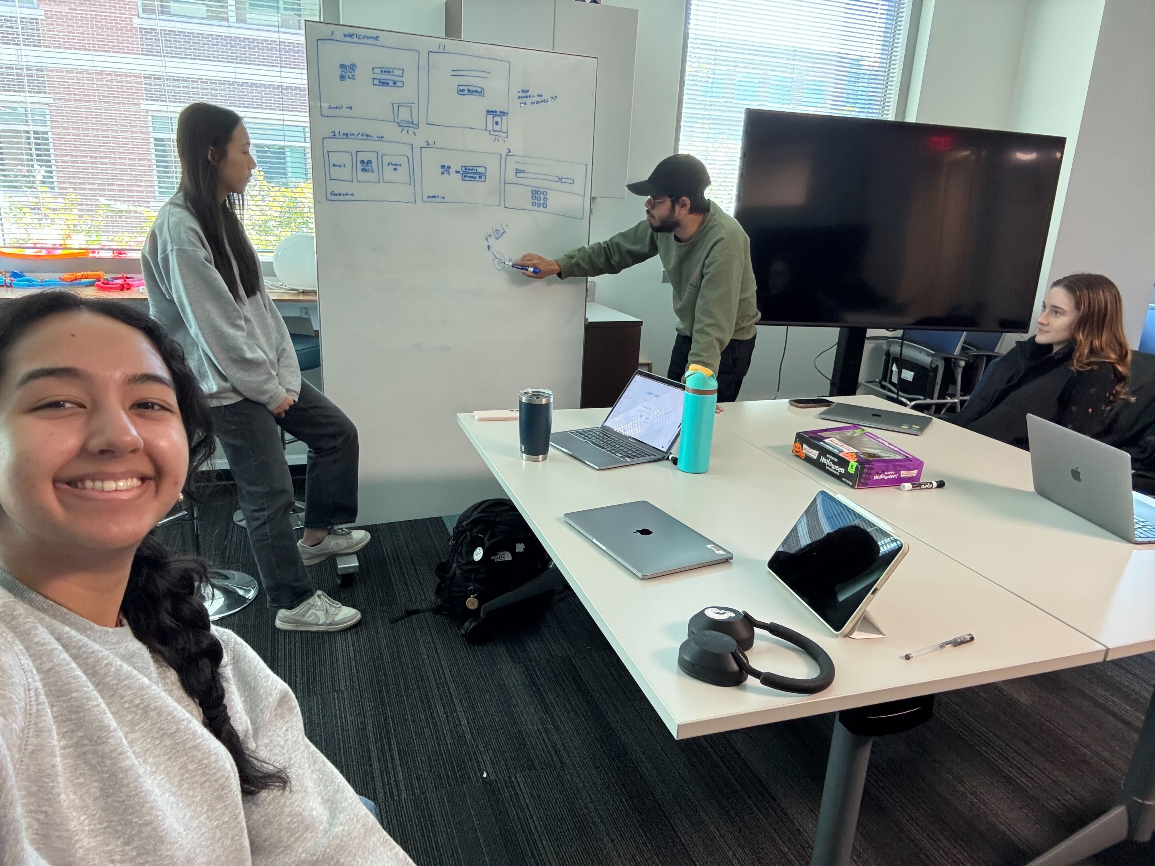
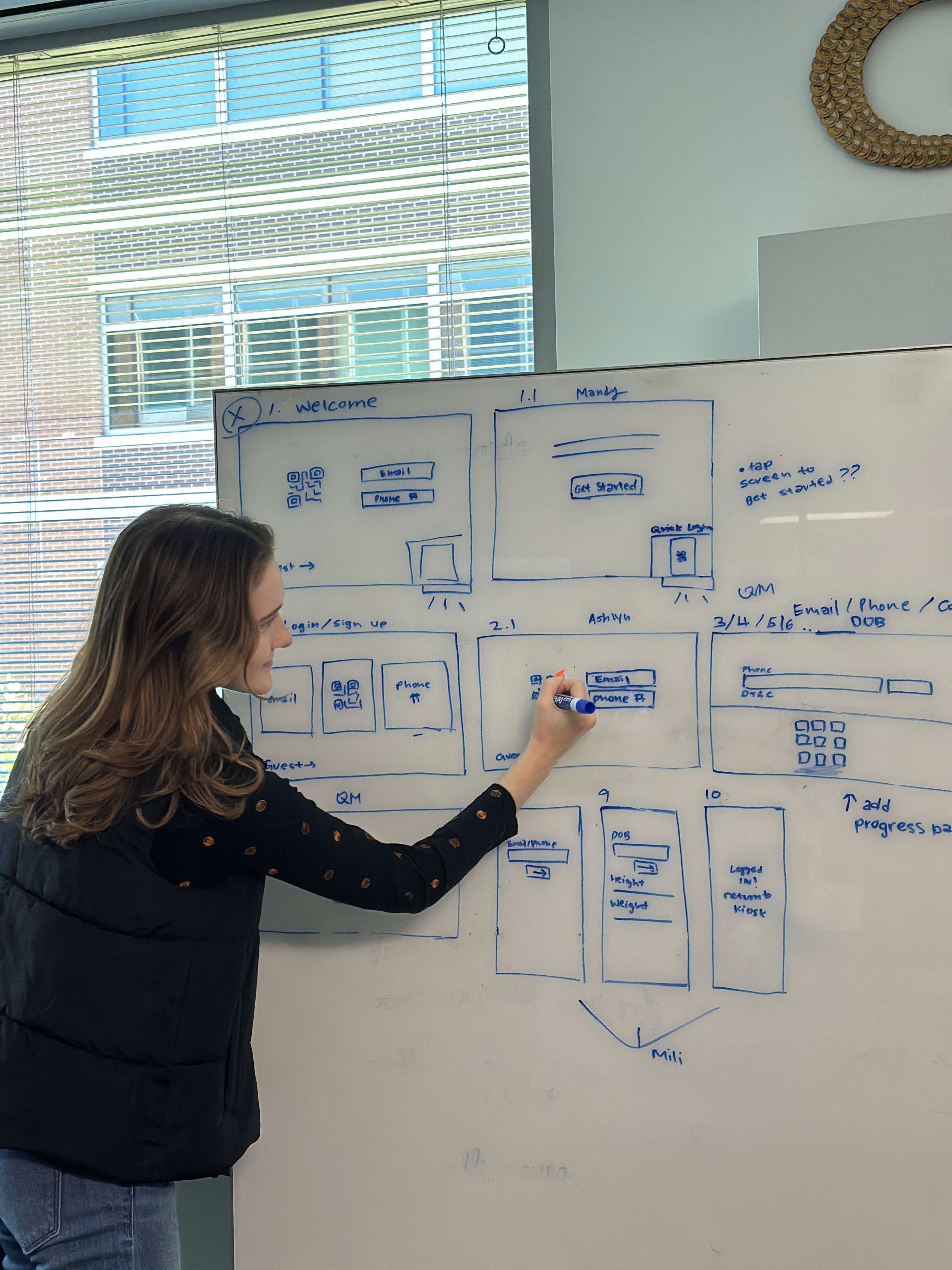
IDEATION & SKETCHING
Guided by our research and project requirements, we transitioned into the sketching phase to explore various design directions. While we collaborated as a group to define the core concepts, we worked individually to explore the visual possibilities of each. We conceptualized three distinct ideas.
Sketch feedback sessions with the three primary Pursuant user clusters yielded clear preferred solutions.
Mobile wallet card & web app received the most positive feedback.
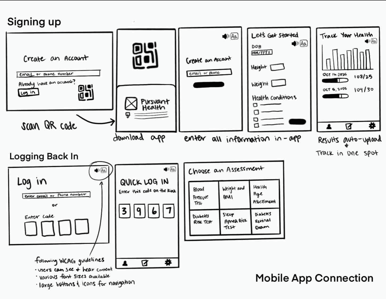
WIREFRAMING
With the mobile wallet and partner handoff web app as our primary focus, we defined the core requirements for our wireframes. These requirements ensured that our designs remained grounded in the specific user needs identified during the sketch feedback sessions.
Wireframe Requirements
#1
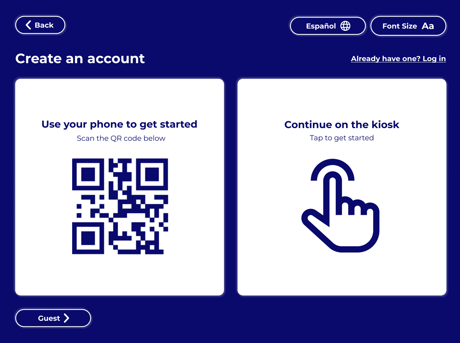
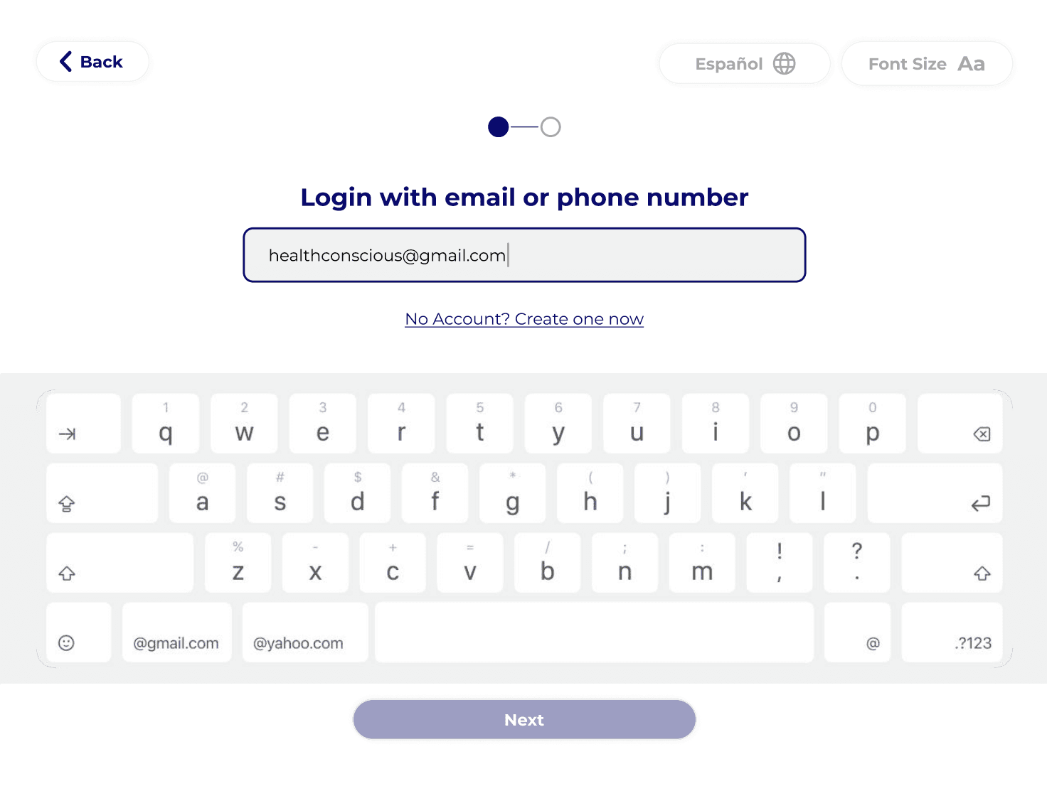
Users should have various login options: email/phone on kiosk, QR code to fill out on personal mobile device.
#2
Users should be able to have a mobile wallet card on their personal device for logging in to the kiosk.
#3
Accessibility should be prioritized in the form of alterable font size, language selection, and large target areas.
#4
There should be persuasive and motivating language throughout the kiosk experience to encourage users to make an account and track their health.
#5
Users should receive a one-time code for two factor authentication to either their mobile phone number or email address.
#6
Design should leverage visual hierarchy to emphasize certain login methods.
#7
There should still be a guest option on the kiosk. This is necessary to account for a loss of network connection which prevents logging in activities.
#8
The design should help users understand why they are volunteering each piece of personal information.
We used these requirements as a guide to develop our kiosk interface wireframes. We began by collaboratively sketching interface ideas, and then moving into interactive Figma designs.
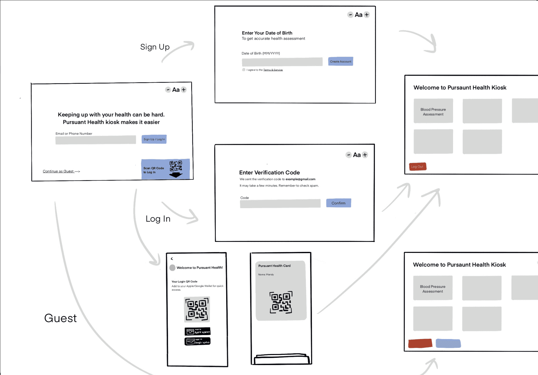
PROTOTYPE V1
With a solid foundation provided by our wireframes, and new design considerations provided by our wireframe feedback sessions, we moved into creating our first prototype. Taking the wireframe feedback into consideration we established the following requirements for our prototype.
Prototype Requirements
#1
The system should display all sign up options in an easily digestible way using intentional language and color contrast.
#2
The kiosk should clearly display its benefits so users understand what they will get out of the experience.
#3
Each piece of demographic information should display its reason for collection to build trust.
#4
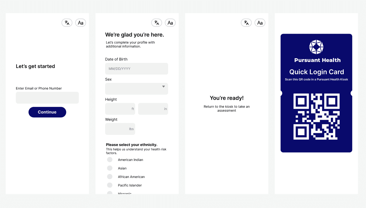
Users should receive a confirmation when their account is created and have clear mobile wallet card instructions.
Our wireframes were created with a loose design structure in mind. The screens we developed were visually similar, but lacked standardization. To ensure consistency, we developed a design system for our prototype rooted in Pursuant’s existing brand guidelines.


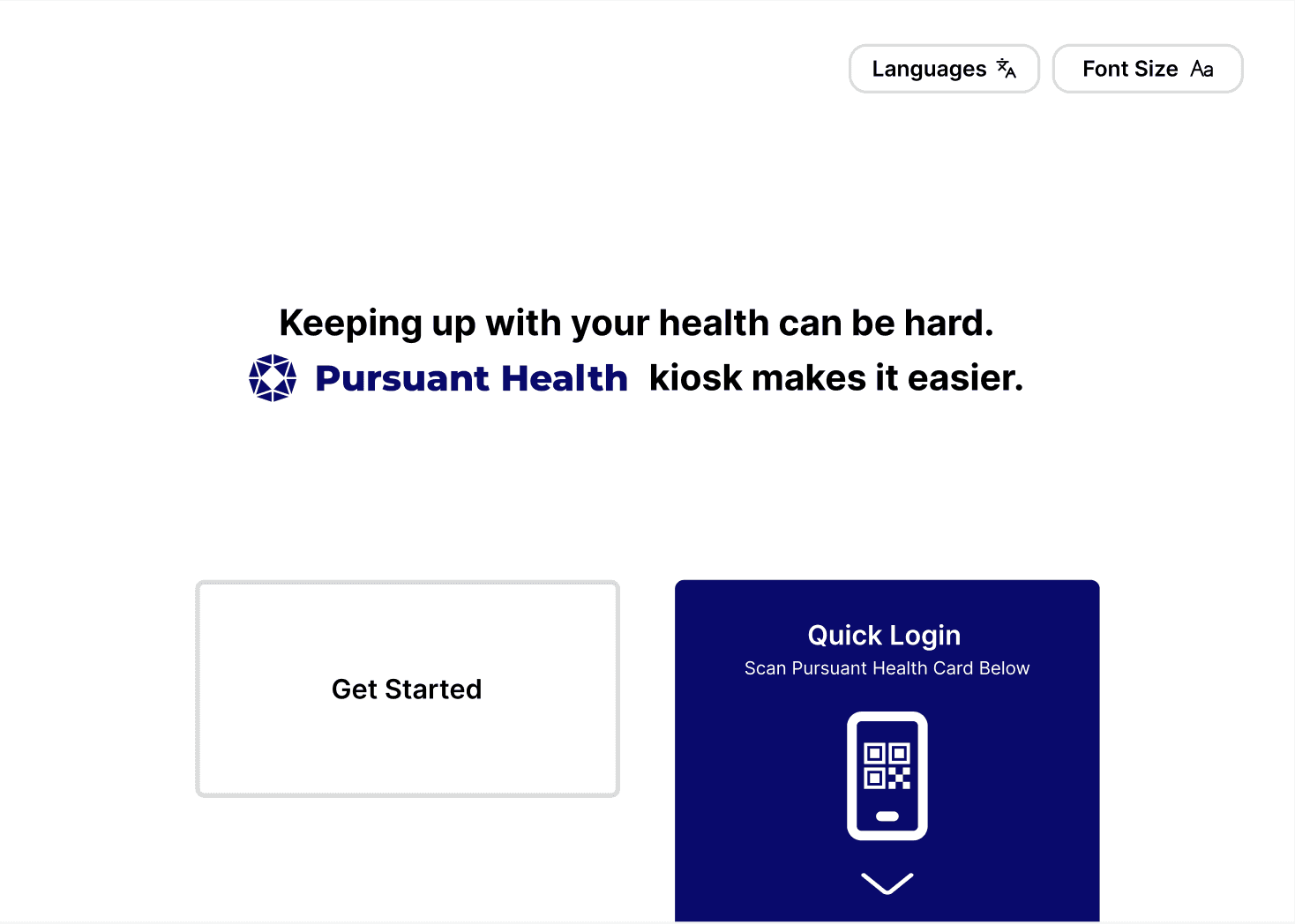
We evolved the aesthetic by leaning into a minimalist UI to create a cleaner, more modern user experience. The initial prototype we developed at this stage can be interacted with below.
Interactive Initial Prototype
EVALUATION & VALIDATION
Following the initial prototype design, we conducted a multi-method evaluation to gather feedback from both experts and users. This assessment consisted of expert-led cognitive walkthroughs, moderated in-person user testing, and the administration of a System Usability Scale (SUS) questionnaire to all participants.
Cognitive Walkthrough
1 Pursuant Designer, 1 CBRE UX Designer, & 2 MS-HCI students
Goal: Identify any usability issues we might have missed with our high-fidelity prototype and evaluate the learnability of our design.
Procedure: Experts were asked to go through 3 tasks and evaluate action steps using the NN framework as well as task-specific questions. Expert evaluation findings were synthesized in a task and sentiment based table: classifying feedback as either issues, suggestions, or positive.
Task 1: Create an account on the kiosk
Task 2: Create an account on your mobile device.
Task 3: Log in to the kiosk.

In-Person Moderated User-Testing
5 participants were in their 50s. 1 participant was in their 20s.
Goal: Identify points of friction users encountered with the visual design or flow of our prototype and gauge user login and sign-up method preferences.
Procedure: Participants were asked to complete 2 tasks with the Think Aloud Protocol. Results were synthesized in an affinity map.
Task 1: Use the kiosk as a new user.
Task 2: Use the kiosk as a returning user.

System Usability Scale (SUS)
All expert and user evaluators completed the survey.
Goal: Quickly and reliably gather quantitative data on the overall subjective usability and satisfaction level of our redesigned system.
Procedure: Participants were asked to complete the survey following their cognitive evaluation or user testing session.

Our evaluations yielded the following findings and corresponding design recommendations.
Finding
Design Recommendation
The way the various options of creating an account are displayed is confusing to users.
Explore different layouts and wording to better present the account creation options to users.
Users are unsure what scanning the QR code will do.
Include language that makes users easily understand they are creating an account.
Users want to see what specific features the kiosk offers before doing any account creation.
The language on the welcome screen should be worded to include a list of some of the assessments offered on the kiosk.
Users are confused about why they are providing each piece of personal information on the web app.
Justifications for why each question is being asked should be present on the web app.
The target area for some buttons is too small.
The buttons should be reformatted to have a larger target area.
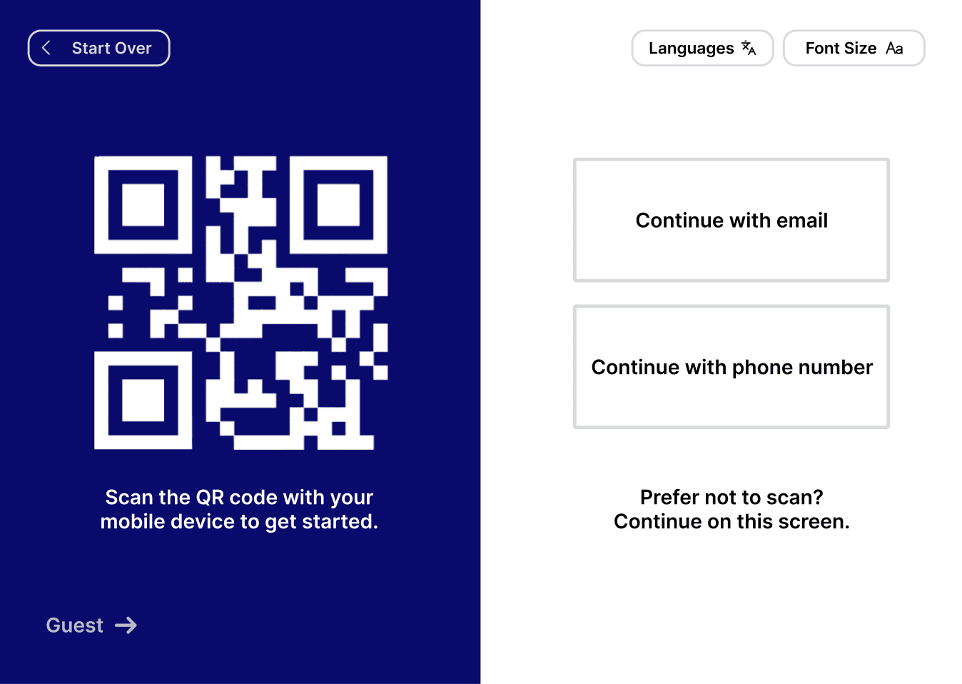
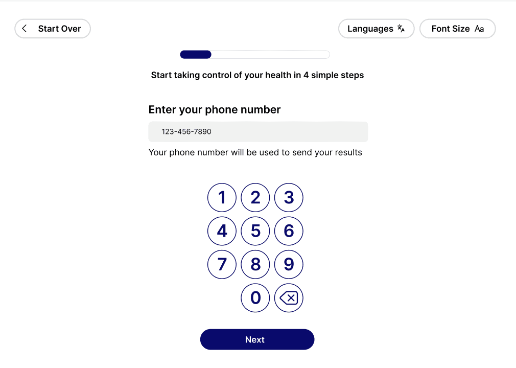
We applied the above design insights to a final round of iteration, resulting in the high-fidelity prototype featured at the beginning of this case study.
PROGRESSION OF WORK
Our team reimagined the kiosk interface through a research-heavy iterative process. By validating our sketches, wireframes, and prototypes with users at every stage, we moved from an outdated baseline to a polished, user-centric final design. Explore the evolution of our work below.

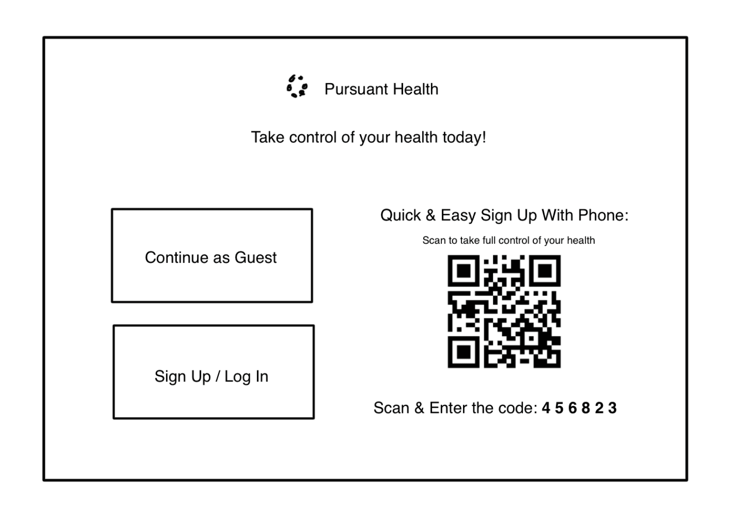
Original

Initial Prototype
Based on user research & feedback

Final Prototype
Based on evaluations

Original

Initial Prototype
Based on user research & feedback

Final Prototype
Based on evaluations

Original

Initial Prototype
Based on user research & feedback

Final Prototype
Based on evaluations

Original

Initial Prototype
Based on user research & feedback

Final Prototype
Based on evaluations

Original

Initial Prototype
Based on user research & feedback

Final Prototype
Based on evaluations
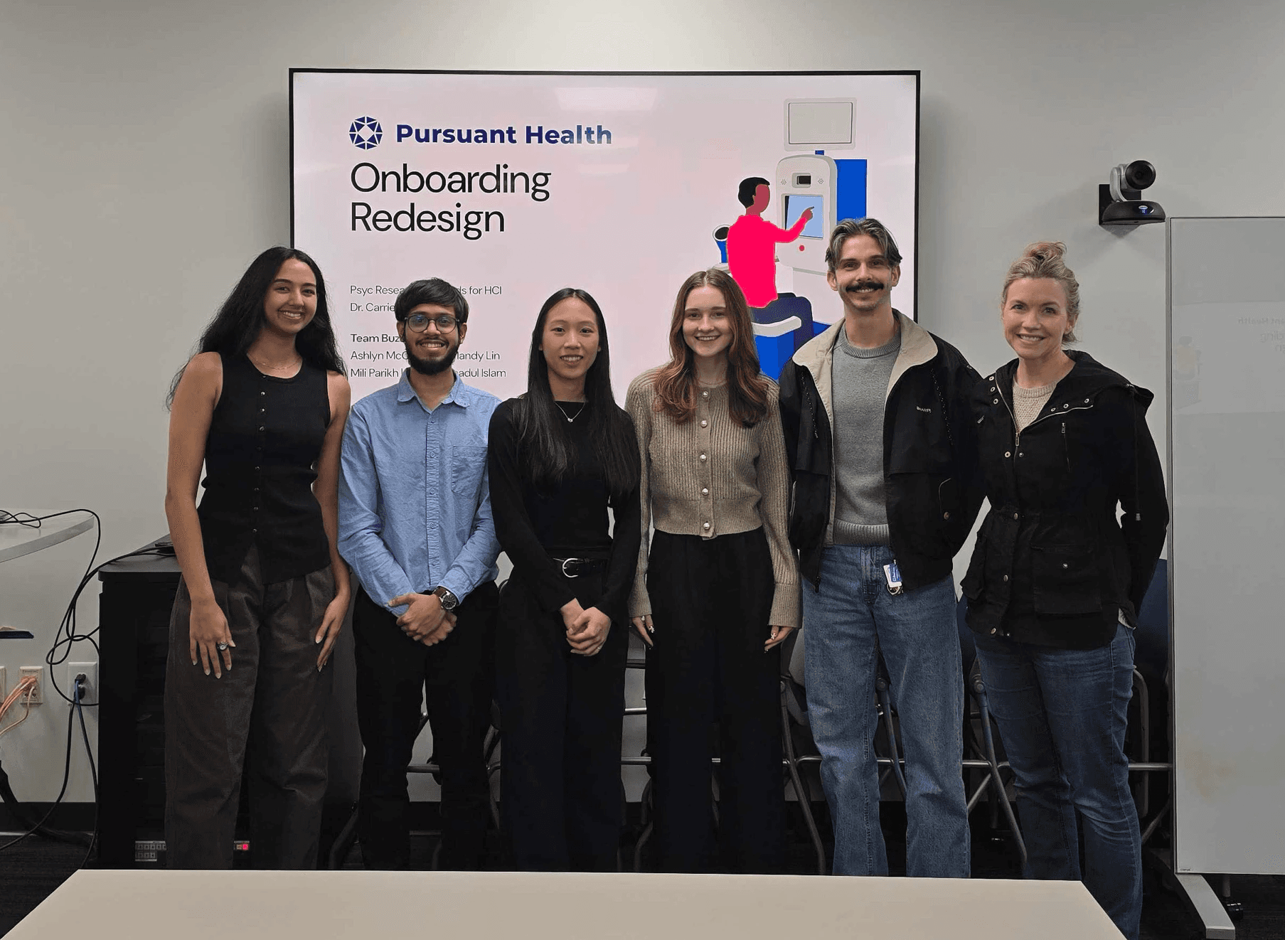
ACKNOWLEDGEMENTS
I want to extend a special thank you to my BuzzLab team members Mandy Lin, Mili Parikh, & Q M Naushadul Islam. From initial research to the final iteration, everyone was indispensable to our success, and I’m grateful for the collective expertise and shared learning that defined this project.
Additionally, I would like to thank Leslie Sommers & Zlatomir Stoichev from Pursuant Health for their guidance and for being such enthusiastic collaborators throughout this process.
This project was truly a team effort, and I'm grateful that I had the opportunity to be a contributor.
Meet the Team!
Great design happens in great company! Get to know the team members I collaborated with throughout this project.

Mandy Lin

Mili Parikh
